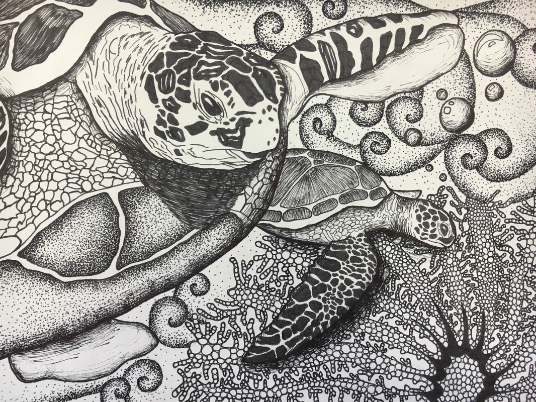
when i started brainstorming for my fourth concentration piece, it was during the five day weekend we got from the snow days. I watched my fair share of movies that weekend, but the one that really inspired me was finding nemo actually. I decided a really cool way to incorporate design into my animal portraits was doing turtles and i could easily incorporate designs into the shells and scales of their bodies. I did not realize how time consuming this really would be as i had to do ever little scale and part of the shells, as well as the background, so this was by far my most complex and detailed projected i have completed i think. The most challenging part for me was trying to create the difference between the smaller further away turtle and the coral it is swimming by. I had to keep darkening over and over and over and i went through about two sharpie pens i think on this one piece but i am very happy with the way that this turned out. The one thing i would change is maybe just darken up the larger turtle just a little but more to just give it a little more contrast between the background but otherwise i really enjoyed doing this piece (Except the stippling in the background) and it is one of my favorites.
For my third concentration piece, i decided to move away from doing pen with this one since i have been working with it so much. I thought it would be cool if i tried out doing a portrait since i have never really done a just pencil only project before. I used my cat as my model and my reference for this piece and took a picture of him laying on our hard wood floors. Overall, i believe that this piece was pretty successful especially it being my first pencil project. Things that i definitely need to change however are to go in and add more contrast between the cat and the wall behind it because i am noticing that it kind of fades into the wall. Also, i know that i drew out all of the wood grain but i could still add more detailing and more shadows to the floor to help it to look more dimensional and therefore more realistic. I drew this piece out on drawing board which, to be honest, i think after this project i am not the biggest fan of so maybe next time i will just use regular drawing paper because to me it felt a lot harder to try and create the values on the drawing board versus when i was just practicing it on the paper. I am satisfied with this, although not my favorite, and it was a good change to do pencil for a piece and is something i would use as a medium in my concentration pieces again possibly.
For my second concentration piece i decided that i would like to do an owl because one, they are my most favorite bird, and two, i am pretty good at drawing them out so that would not be a problem. I decided i wanted to do a owl flying so that you would be able to see all the detailing in every single one of the feathers, something that you would not be able to see if the owl was just sitting on a branch or flying at a side angle for example. I first drew out the owl in pencil first so anything that i would need to erase could be removed . Then i proceeded to pen in all of the detailing on the owl and the shading. I always have a problem with the fact that after i draw out the animal i never know what i am go thing to do for the background. I kept thinking about rolling hills and mountains in the background because that kind of what i always think of when i think of owls but that seemed like a pretty boring background so i decided to do a small town nestled in the rolling hills with a lake in front of it which i did in pen as well. the hard part on this project was actually doing the background because the detailing had to be so tiny and small it was hard to get shading in on something that small. My favorite part of the entire piece actually turned out to be the small town in the background however because i was really happy with how the lake turned out and the shading in the lake was nice and i am just overall pretty pleased with it. This has actually been my favorite piece of work that i have done so far i really enjoyed completing this.
It took a lot of thought for me to come up with what i wanted to do as my concentration. I kept going back to animal portraits because i do really enjoy drawing animals a lot and that is what i am better at, but im not to crazy about prismas or painting. Then i kept going back to the mechanical nature project where i made the mechanical wolf which i really enjoyed doing, and how i incorporated design into the fur. Then i started thinking about what animal i could maybe work with to get the same kind of concept going and then i thought about horses. Could incorporate the design into the mane of the horse and then i decided that would be my concentration. Incorporating design into animals with pen work. So for my first concentration piece i did a close up of a horse wearing a halter, and in the background i did trees but to make the trees look different as well i made the trees spirally. I really am very happy with this piece and i really really enjoyed doing it. I think that i really enjoy working in pen, i like the way that you can create value using just one color, and i like how clean you can make something in pen really look if that is the style that you are going for. What i had difficulty with however, is creating a greater contrast between the horse and the background trees. Also, it is very hard to force yourself to go darker and darker with the shadows and certain parts of the horse like eyes even though the darker, more contrast, and more detailed it is will only help the piece to look as good as possible. I really enjoyed making this piece and am confident that i chose the right concentration for me bc its something i like to draw and its something i wont get tired of doing eaither.
for this project, we had to choose a picture of a landscape that we had photographed either for this project or at some point in time and it was generally supposed to be painted. I decided that i had wanted to do water color because i really enjoyed using them when i painted my job lifeguarding at the pool, and when i did the unusual interior of the fridge in watercolor as well. This however, turned out to be a fatal mistake because this project went horribly wrong and i deffinitley learned that i am not skilled in the area of watercolors to say the least. The landscape was a picture that i took two years ago at a zoo, and it was a small pond with trees and bushes in the background and flamingos standing around the pool. I thought this would be a really could scene to paint because flamingos are such an exotic colored animal, and there are so many cool colors incorporated in this like the green blue pond, and the pink flamingos and yellow sand it just really is a cool idea. i started with the trees in the background and i thought they were turning out pretty good but then i moved on to the sand and the flamingos and everything just went downhill from there. I think that i just have a lot of trouble getting the depth in the landscape with water color because everything kept turning out to look like just one straight color with no shadows or anything, so i tried to incorporate the pen in there to try to bring out some demensioning and make it look like it had a little shape to it but that turned out to just be in vain. Its really frustrating because i spent so much time on this piece just to have it turn out not how i wanted. I would like to learn how to correctly use water colors because i really truly do love how they look and how amazing it can turn out if done right soi would like to learn how to do them to eventually redeem this piece and redo it.
This project was actually supposed to be done with our mentees but i was absent those two days that we worked on it so i went ahead and completed this seperately. I am happy with this project, but as it is a collage im not exactly sure what it is supposed to look like, i guess what ever we envisioned it to look like. i used a lot of magazine pictures for layering in mine because i really liked the way they looked and they added a cooler, more artistic look to the collage. The more card board like pieces that i was trying to get to stick on there i had some trouble getting to stay on, i had to glue them like three or four times. I really like working with the glaze however, after you put it on it helps to make everything smooth and it makes the overall appearance a lot better and clearer. Overall im pretty happy with this, i like the way it turned out and i actually think that its really cool and original looking and a really cool concept.
For this project, we had to do a portrait of our pets, or if we did not have a pet, a portrait of a friends pet. I decided to a portrait of my cat Simba, mostly because i had more pictures of him and his fur would be more fun to have to do versus a my dogs hair which is very short. I had a lot of trouble trying to figure out what i would like to do it in, and i ended up getting stuck between wanting to do it either in prismas or paint it in oils on canvas. Ultimately i prismas, more because i am more comfortable in them and i have never done an animal with prisma color colored pencils before. I chose the toned- tan paper that i for my sketchbook to do this project. Concepts for prisma color colored pencils that are really hard for me to grasp are the fact about layering, and i dont know, its weird to me still that my cat is orange, but yet i did not use a single orange colored pencil the whole entire project; i just used different shades of browns and yellows and it made the fur the same color as his. My favorite thing to do was his eyes because i really enjoy making things reflective and the eyes are the most reflective part of the project. Even though in the real picture the wall is actually a yellowish tan color, i decided to make the background a torquise blue color because the yellow wall was just too similar to the colors that i had already been using. I do wish that i had done the background first so that it actually did look more like it actually is in the background and maybe the shadows from the cat that are cast on the wall might have looked better. Overall, im satisfied with how this project turned out although not one of my favorites but i am happy with this.
For this, everyone in the class was given the same picture, a picture of a group of a variety of pumpkins and gords set up in a scene together. The task was to recreate the photo however we would like. Some people zoomed in on a portion of the picture, some people only used part of the picture (me), some people added other elements to the picture that were not even there, such as animals. These were to be done in prismacolor colored pencils, since this was a colored pencil challenge, and it had to be submitted online by December the 16. This was actually my favorite colored pencil piece that i have done so far, just because i think that i really chose the correct color of paper for this project and i really am happy overall with the way that it turned out. The hard part for me was really trying to get the gords right because they are so textural and they have all the little bumps and curves all over them, and they are oddly shaped. IT was difficult for me to really capture the texturing with the colored pencil and i had to spend quite a bit of time on just one tiny gord to be able to get it to look they way that i wanted it to look. The flowers were also tough, it was really hard to try and capture the way that the flowers looked in the actual picture as well. I think i did a pretty goof job learning how to do wood grains to try to make it look more realistic, because doing wood in the past has been really difficult for me so these really helped me to have growth with my prismacolor abilities. Overall, i am very happy with this piece and it was a fun little side project to work on and i really really enjoyed it.
For this project, we had to go out and take pictures of ourselves for our self portraits. Since i had just gotten a pair of new glasses, i decided that i wanted to take a picture with them, and just experimented with different angles and different cropped versions of the pictures till i got what i wanted. The picture that i liked the most was when i cropped from my nose down off of it and blew it up, because then it makes my face come off the page which makes it look really interesting versus if it was just normal with the whole head in there. I really wanted to incorporate watercolor into this project for some reason, i think because i really liked using it in the two pieces that i did over the summer and its also really fun to use and can look really cool and different, I kind of wanted my self portrait to be on the different side and be a little more pop culture inspired, so i wanted to do a design in water color in the background. I took a brush and like seven different colors and just painted big circles over and over so that they would overlap each other in the background until it took up the entire page. Then, i drew myself in pencil first in the background to make sure that that's how i wanted it, and then went back over it in detail with the pen. After i was finished, i think that it turned out really well and i was planning to actually crop the top part of the piece off so it was just the head but then i thought that it might be cooler if i put something up there. Since it kind of looks like i am thinking about something in the picture, i thought i should but a thought bubble up there which i actually really ended up liking and cant see the piece without it. Overall i think that this turned out pretty well and am pretty satisfied with it, but i would like to maybe do a lot more detailing with the hair, i feel like that is a little lacking.
For this project,we had to come up with an idea of something to do with nature and turn it mechanical. For the most part, we were to do it with drawing methods as opposed to paint and canvas. My three main ideas for this project were to do a mechanical wolf, a mechanical stag, or a mechanical orca whale. In the end, i landed on doing the mechanical wolf because i figured that would probably turn out the coolest because i could add a lot of detailing into the fur and make the gears look a part of it. Next, for my medium, i was torn between doing it in graphite and pen. I started out doing it in graphite, but the way that the piece looked in my head i thought that this would best be presented in pen. I really really enjoy working with pen and the way that it gives the piece a really clean, smooth image like as if it was printed off online or something. The thing that gave me the most trouble with this project is the background. I wasn't sure what i was going to do for the background after i drew the mountains in, but it just did not look right in just plain white like that it was too dull and boring. I decided i wanted to make the mountains mechanical as well since they are a part of nature anyways so why shouldn't they be? I love the way the background turned out, but i do not like the way that it now takes away from the wolf. When i get the chance, i think that i would like to go back in and color all of the white part in the background of the mountains maybe a bright color like a red or a blue so that the wolf will pop out again because it is really the center focus of the piece and needs to stay that way. Overall, i really liked the topic and the idea of this project and it was a fun and creative idea although i was not sure about it at first, and i would definitely like to do it again.
|
AuthorWrite something about yourself. No need to be fancy, just an overview. Archives
March 2016
Categories |