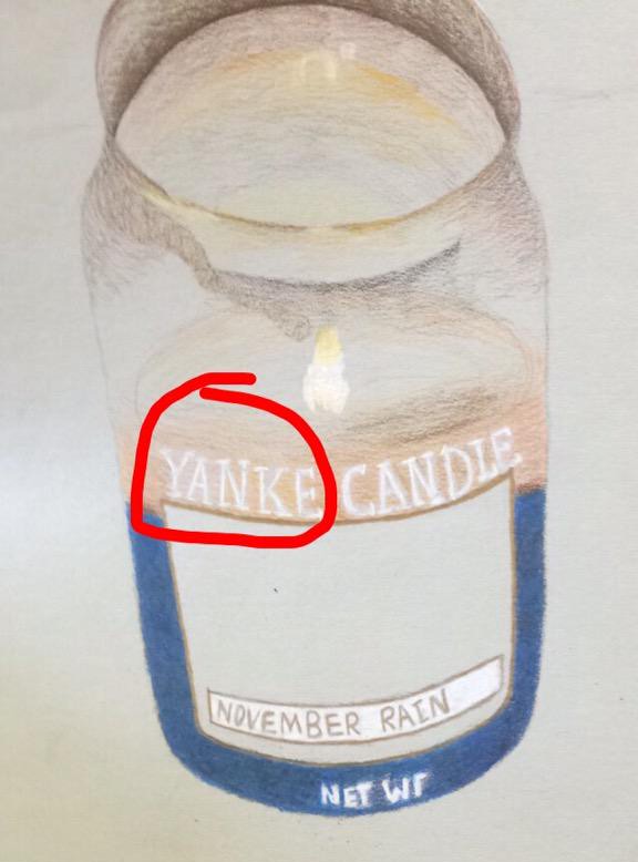
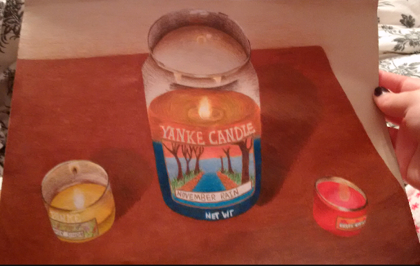
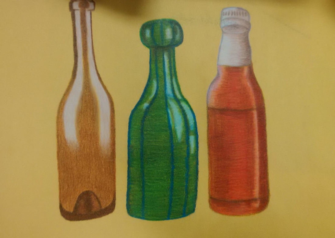
The Representational Reflective Drawing is our first in class structured project that we had to complete. For this project we had to think of things that would create a cool reflection in them, and then we would draw it out and color them with prisma colors. I had a hard time coming up with idea for things that I would want to do for this project but the top two that I had originally came up with was I set up all of my prisma color colored pencils and had them reflected in a circle in the lid of the prisma color tin. My other idea was having my cover for one of my records reflected in the record that goes in the cover. I actually ended up doing this three candles that I saw sitting on the table in my house one night though, because I noticed when you looked at it a certain way you could see the flame of the candle reflected in the back of the glass which I thought looked really cool and decided to do that instead. This was the first real project I have done with prisma colors in school and I actually think that I really enjoyed using them this time; I like the transformation your project goes through as you layer more and more color and it looks more and more realistic as you do that. I think this project turned out a lot better than I had expected but I would like to maybe try to go in and add more "wood-like" features to the table and go in and darken the shadows behind the candles so they stand out a little more but overall I think I am happy with it.
For my mixed media summer project I decided I wanted to paint this colorful chess set that my sister had out one day and was messing with and I thought it would be really interesting to paint. I decided to paint it on a canvas using pen, watercolor and acrylic. I used watercolor and acrylic on the background of the painting that is supposed to be representative of the chess board. For the three chess pieces I used acrylic and the pens for the shading. For the most part I like how this turned out except the pens used on the yellow chess piece gave the shadows a shiny look which I am not really a fan of so I will probably want to go back and fix that when I get a chance. Also, the reason that the chess pieces are different colors is because I actually ran out of the blue paint so the third chess piece actually ended up having to be yellow which I think turned out pretty good and is actually my favorite one that I painted.
Over the summer we made dream catchers with this volunteer y group and they turned out really really cool so I thought that it would be a really cool and interesting thing to draw a dream catcher. I originally wanted to do this in pen but I had a really really dark valued pencil with this pencil kit that I bought so i decided to use that and I really like how it made the values look and the contrasts from light to dark. This especially helped with the feathers because they would fade from dark to like and alternate patterns and things. I really like how this project turned out I think but if there's one thing I would like to add I would like to maybe get some kind of pop of color in there somewhere because I really don't like just the black and white so I don't know maybe if I could make a colorful background or colorful feathers or something.
For the drawing of three glass bottles that I had found around my house, I decided to use prisma color colored-pencils because I have always really liked the way they look and also I have never used prismas before so this would be a cool new thing to try. I found that prismas are really hard and challenge to get the hang of, the trick with layering is really hard to figure out. I think the project turned out pretty ok for my first try with prismas especially since so far I am not really a big fan of them. I do think as the bottles progressed that each bottle was better than the last though because I was figuring things out. I would like to go back in and add a background or shadows when I get the chance; I don't like how the bottles are just floating in the middle of the page.
For the Summer Work local hangout drawing all this summer it felt like I was at the pool every single day between swim practice and life guarding so I took a picture of the pool one day at work and thought it would be a pretty cool thing to do for the local hangout project especially with the angle from which the picture was taken and everything. I decided that I wanted to do this in watercolor because i thought I would be able to show the water really well with that medium and I had really liked working with the water color and pen from the previous project so i decided to do it again. I liked this project alot but one thing I would like to do better would be add in more shadows and detailed values with the pen.
For the summer work unusual interior I thought it would be a really good idea to do a refrigerator because of all the cool different kinds of shaped items and bottles that can be found in there as well as the variety of colors which would be fun. For my fridge I painted it with water color and went over top of it with black pen so the detail would be really visible and you could see each individual item in the refrigerator. This was my first time ever doing anything with watercolors and I actually think that I really liked them and they were fun to work with but it was also really difficult trying to get that happy medium with how much water and paint to use at a time. I actually got on a water color kick after this and my next project was also done with the water colors as well.
For the summer work portrait I decided to paint a picture of my cat Simba vs doing a self portrait. I did kind of a green wash in the background using all of the different shades of green that I had or that I could make. I think the cat was ok and that I did the fur pretty well but I would like to go back in now and try to give it a little more shape or volume so that it looks less flat. I would also like to do more with the cats ears because I feel like if I really get them right then it could really emphasize the cats 3 dimensional figure. and really make it pop more off of the canvas vs how flat it looks now.
|
AuthorWrite something about yourself. No need to be fancy, just an overview. Archives
March 2016
Categories |