https://docs.google.com/presentation/d/1-CH6svDzgfybum8ckTDOu0RFfhsB4M6-wwcZGbnm5kI/edit?usp=sharing
|
I know over the beginning of the summer i was so terrified of taking this course and i could not believe that i had put this down to take for my schedule. At the beginning of the year looking at all the AP art kids pieces from last year was so intimidating and scary but i stayed in the class anyway. I had never had Mrs. Rossi once throughout all of the art classes that i have taken and had never used prisma or oils but it was so fun to get to learn these techniques and styles. Being able to grow and discover what concentration and medium that i liked best was so great and such a good feeling. Participating in this course has helped me to grow creatively in ways that i might not have if i had never taken a chance and tried something i was not sure about and i am so glad that i did.
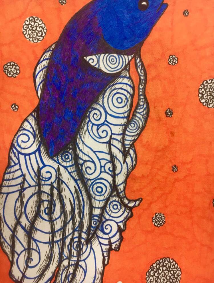
The best part of the class besides the art for me however, was getting to meet all these great wonderful people. At least half of these people i didn't know well or at all before this class, so i love how we all got to know each other and learn and help each other to grow together as a class. Being here helped me to become friends with people that i otherwise would have probably never met as we are all graduating. I am so glad i got the opportunity to learn with these people for my very last year at high school. This class will be the hardest to leave behind when it is time to walk at graduation, but no one will forget the memories that we have created, artistically and with friends. 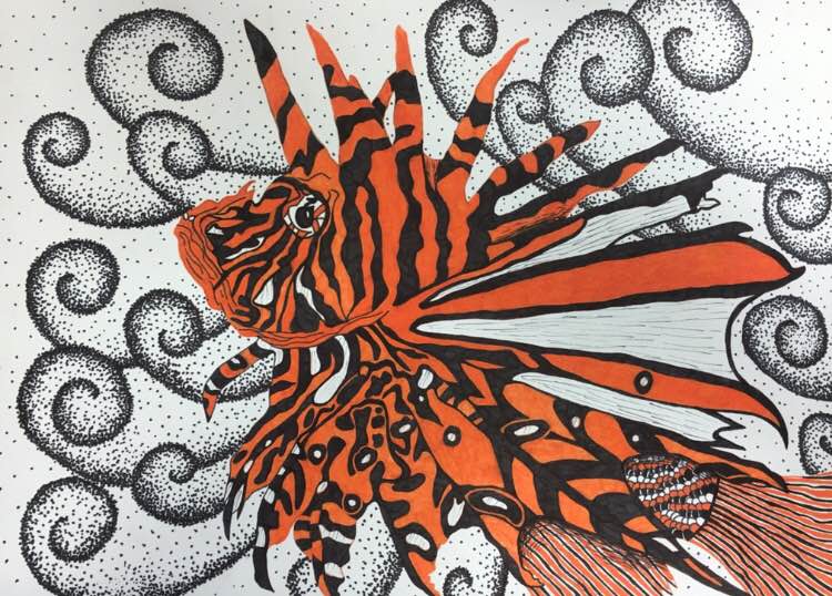 I actually really really like this piece and i am very happy with it. I had no idea what i wanted to do but after doing the sea turtles i realized how easy it is to do patterning in sea creatures and that just makes my job way more easier. So i started looking up pictures of super patterned fish and sea creatures and then i saw a picture of a lion fish and decided to draw it because i hadn't really done a whole lot of orange yet (this was before the beta fish piece) and i knew that i wanted to actually fully color the whole animal instead of shading parts with designs which i did with the other pieces which i think was overall more affect for this fish just because it stands out a whole lot more. After i drew the fish out i went over the whole outline of the shapes and body with black lightly so i could see what i was doing better. The hard part was figuring out next which parts were going to be black and white and what i was going to color orange. My favorite part of the fish is actually the tall just because i was really worried about doing the scales but after i colored them in and shaded around it i think that it turned out really well and i kind of wish i had incorporated that scaly pattern somewhere else in the fish as i love that part the most. Figuring out the background was a challenge just because the fish takes up most of the room on the page already and i had no idea what to put in there that wouldn't look to crowded and take away from the fish. I decided to do the stippled swirl looking waves that i do so much, which i hated after i started because i forgot how long stippling takes but i like how it turned out in the end and im very happy with this piece.
 for this it was actually our mechanical piece but I liked it a whole lot better than the lady bug because I did not spend a whole lot of time on that one but I did draw it out very well I think. I actually took a picture of a ladybug that was in my house and then made up the background on my own. The background would definitely be something that i would change as i feel like it really actually takes away from the piece just because i worked a whole lot harder on the ladybug itself than the leaf and i think that it really shows in the piece. I do like that i incorporated the pattern into the circles on the wings though i really do like that about this one. As this is one of my smaller pieces being pressed on time, if i had the chance i would probably make the choice to make it a whole lot bigger as well because i feel like if i did have more room to blow the bug up then i would be able to better add the detailing into the bug and thus make the piece more pleasing to the eye overall. I am pretty satisfied with this one however and it does go along with my concentration so i guess that it is okay. 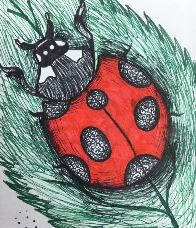 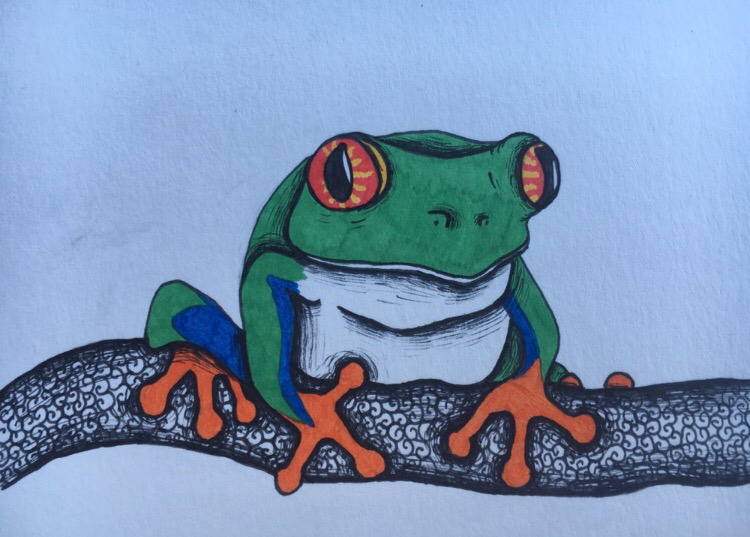 For this concentration it was kind of a random one, I wasn't really sure what to do for it except I knew that I wanted to make it different from the butterfly and make the plant all black and white and the animal colorful instead of the animal black and white and the plant colorful. My sister had actually caught a little outdoor tree frog earlier that day so I decided to draw it out and I'm actually not very happy with how the frog itself was drawn for the most part that's the one thing I would Probably change if I were to do it over because the frog looks really fat the way I drew it with the tummy rolls and everything and I don't particularly like that. I also forgot to put the yellow stripes on the limbs in but it was too late to do them once I had already went over it with the green. This is one of my smaller pieces and one of my more colorful ones as well which is the aspect of it that I do really like but I would like to go in at some point and incorporate a background because it does look very empty just like that .
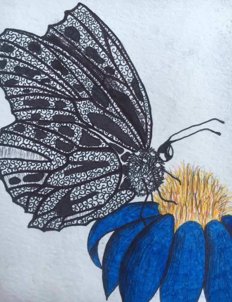 this piece I was kind of rushed so it is a lot smaller, but I did a butterfly and I decided to make the butterfly black to kind of make the flower stand out and pop a little more which I think worked pretty nicely. First I drew out the butterfly and although butterflies already have all that natural patterning going on I decided to use that same swirly pattern I used with a lot of my pieces just because it did really remind me of butterfly patterning and I really like it. Doing the wings were hard however because it did get hard to show the difference between the wing closest to the viewer and the wing behind the other and I think the patterning and shading got a little muddy so I would change that. My favorite part of the butterfly that I did would be the fuzzy looking body of the bug just because I feel as if I conveyed the way that the body does have that texture. I also used that texturing with the yellow pollen parts of the flower which I really like, but I would change the flower because I did try to show the dimension of the blue flower by shading with the black pen but it still looks flat to me. Also I actually did this piece on the wrong side of paper so the texture of the paper was a little weird which bothers me as well.
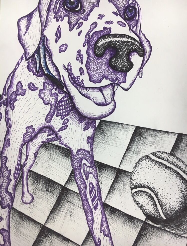 for this concentration peice I took a picture of my dog Ellie and decided to draw her right after she brought a ball back that I threw. This was the first peice that I actually started using color and I think it turned out really well. First I sketched the dog out and then went over it with the purple lightly, and then began shading in the darker areas and the outline. For her spots I actually put in patterns that I used in most of my other pieces, I did go along and try to use the same ones and that did make it easier as well. With the eyes I didn't want to just do the black or purple so I actually used a lot of blue in them to help it stand out a little more but then I thought that it didn't match so well so I did go in and make the collar blue as well. With the nose I saw in the picture that there were a ton of tiny black round circles that kind of give it dimension and show the highlights and the fact that the nose is wet as well so I tried to show that with the black which I think that I did a pretty decent job with. Doing the teeth was hard, I was not really sure on how to do them but I think I did a nice job and that it looks okay. If I could go back and change something it would be the floor because I love the way that the tennis ball looks but the way that I shaded the tiles makes the perspective seem all off and wonky to me so I don't really like that but overall I am pretty happy with this one and I did send it in.
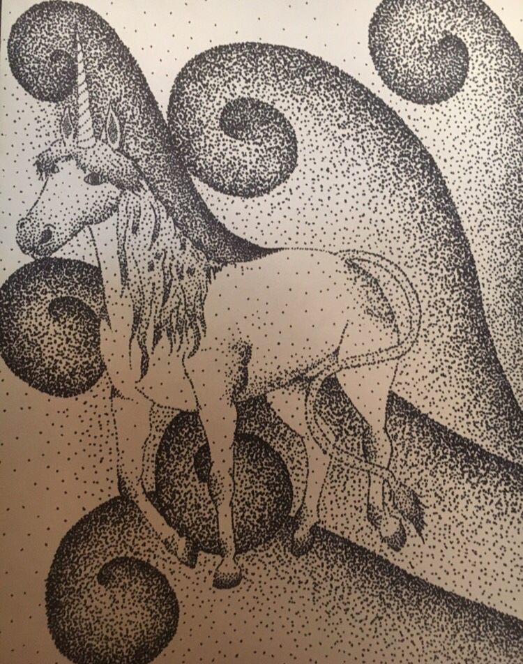 this piece is actually one I pulled from my art two class I believe , and I did this in all stipling. I kicked out the pencil cat from my concentration as it did not really match as well and this one went along nicely with my concept. Considering that this was only from art two I think it looks really good for my skill set and it does match all of my other concentration pieces with the pen medium and I actually realized that for a lot of my pieces I used those same black pen stipled swirls and this as actually the very first piece that I ever did those with. If I could change this piece I would make it not a unicorn as that is not a real life animal like the ones from the rest of my concentration, and if I was to go back and redue this, I think it would turn out a whole lot better just bc I could draw it out a lot more realistically and better detailed I think but over all I'm pretty satisfied with it.
 this is my sixth concentration piece. I was not really sure what I wanted to do for this one, it took me a long time to come up with an idea for it but my sister had just gotten a new beta fish and I was just sitting there staring at it and then I realized that I should draw that. So I decided to take a picture of the fish while it was resting near the top of the bowl and then drew it out in pencil first. I use the swirling pattern a lot and I thought that for the fins and tail that it would help to show the movement and flow that the water gives to the tail. I didn't know really what I wanted to do for the body and at first I just lightly scribbled it blue and purple with the pen but that didn't look great so I colored it darker checkered blue and purple which I think worked out really well because it creates the scale looking effect for the body which u actually really ended up liking. I was so sick of black and white and didn't want to use blue for the water so I just kinda got bored and decided to use orange, and used the black and white swirls for the bubbles, which does make the piece look as if it's swimming in orange soda which would probably be the only thing that I would change but oh well. I actually was pretty happy with this one dispite the size.
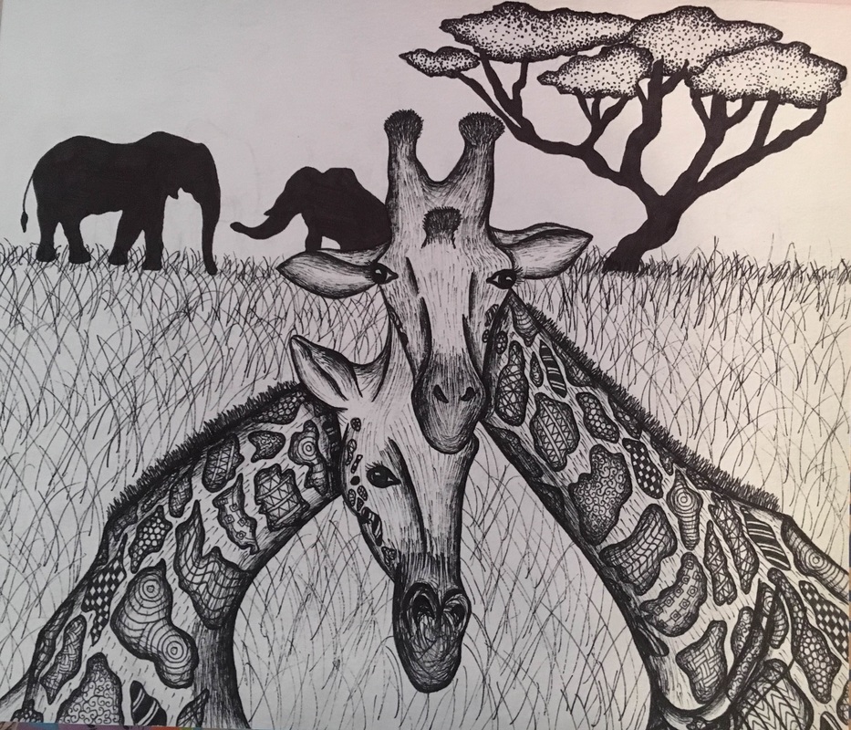 It took me a really long time to come up with an idea for this project actually but then i started thinking about animals with spots and how i could make the spots have all of these different patterns and designs incorporated into the animal. Giraffes obviously have a lot of spots so i thought why not a giraffe. I wanted to do two giraffes because that seems to be more compositionally appealing. First i drew the giraffes out in pencil and then went over top with sharpie and then erased the pencil from the paper. Then i started drawing in all of the different patterns and the facial features of the giraffes, and then began shading to add the dimension and value to their bodies. I never ever think about what i am going to do in the background of any of my pieces so then i got stuck on that, but then nicole gave me the idea to do those wierd savannah trees that are all scraggly and crazy so that was fun. Then there was all of this open white space so i just filled it will grass and elephants by the trees. Overall i think that this piece turned out pretty well and i'm pretty happy with it.
|
AuthorWrite something about yourself. No need to be fancy, just an overview. Archives
March 2016
Categories |
 RSS Feed
