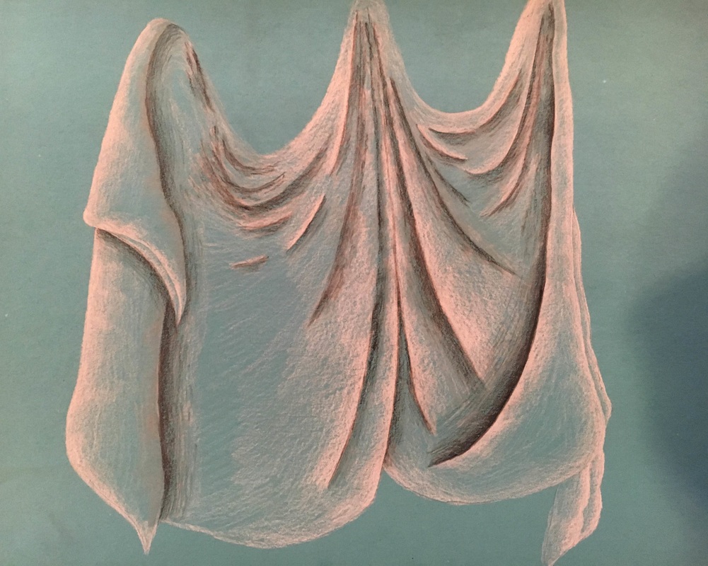
a sheet was hung from the ceiling in the middle of the classroom for this project, and we had to practice drawing it a few times in our sketchbooks using either charcoal or pencil. I decided that i wanted to use charcoal for this project because i don't really love using pencil for projects and just because i have never really used charcoal before so it would be fun to try something new and different that was out of my comfort zone. The really hard part for me at first was just sketching it out bc its such an odd shape its really hard to draw out and capture the different folds and creases and everything for me. If i could go back and re do this project, i would draw the creases and folds a whole lot differently because the way that i drew them makes the sheet kind of look like there is a person under it or that it is a ghost because the folds are all curvy instead of jaggedy like they actually were supposed to look in real life so i would like to change that. Other than that though i was really happy with this piece and my shading of it overall and i think that it was pretty successful for the most part.
For this project, everyone in the class was to bring in an item or two for the still life, and they were all arranged in a way for us to pick a section of the still life, and draw it. We practiced first in our sketchbooks and drew six different sections of the still life and chose our favorite one for our final. For my final, i decided to do my still life in pen just because pen is my favorite medium and i really enjoy working in it, and also because i have never done anything that big in pen before or anything that was not really an animal in pen before as well. First, i would sketch everything out in pencil and then trace back over it with the pen and then erase the pencil from underneath and then i would go in with the details and do the shading last. I would pick a particular item and complete all the detailing on that whole item and then move on to the next one, and i did the sheet last. Doing things in pen does cause me to work a whole lot slower than i might in pencil so by the time i got to the sheet i didn't have a whole lot of time, i just had just enough time to shade the creases in the sheet. I would have liked to have been able to go in and do the detailing on the sheet and do the stripes and patterning if i had had the chance. The hardest part for me was doing the snow globe, it was really hard to draw the toto dog out and get the writing at the bottom of the snow globe to look like it was fading off and curving but i think it turned out really nice and i am really happy overall with this piece.
For this unit in class we learned to use prismacolor colored pencils for our medium. First we practiced all the different kinds of shading techniques on black paper to get the hang of using them. Then we all chose a dum dum lollipop which ever flavor that we wanted and were to draw it and color it on the paper of our choice. Personally, i'm not the biggest prisma fan just because i don't really like shading with them and layering and everything, but i do really feel like this project helped me to grow in my ability to use them a whole lot more efficiently and i actually like them a whole lot me after completing this piece as well! I liked that i used different colors to shade in the white to make it more interesting and it was really fun to do. The hard part for me was trying to get the font for the words on the wrapper to look how they do in real life and draw it out just right which was really difficult for me but i think i did a pretty good job. I really liked doing this project and i would deffinitley ten out of ten do it again
this was our second official project using pastels, which i'm not really the biggest fan of and i don't think turned out amazing but its okay. There was a variety of candies we could choose from, most people did smarties or jolly ranchers bc there were the most of those, but there were a couple of mints so i decided to do one of those since i wanted to do something different. i do enjoy using the pastels and i think that they are really cool and fun to blend, but i think this project is off just because maybe the shape of the mint is a little wrong or maybe because the wrapper looks strange to me, i'm not really sure what it is. id like to go back in and create more highlights on the edge of the candy so you can really tell that it does have dimension and that it isn't just flat, as well as maybe go in and add more shading into the creases of the wrapper to make it look a whole lot more realistic. I think that if i did this over again maybe i would just choose a different candy because i am really not a huge fan of this.
For this project, we had to take a picture of eggs with dramatic lighting, and re create the picture using all different colors and pastels. At first we practiced on the black paper to get the feel of using the chalk and did little mini egg shapes to get the feel of how to shade the eggs and everything with the lighting. My favorite egg that i drew was the blue and green and yellow egg just because of how smooth the transition is and it has the most colors incorporated into the egg. The hard part for me was trying to figure out how to shade the egg when it was laying on its side, and if i could go back and fix that i would because it looks a little off to me. This project made me realise i dont hate chalk at all its actually pretty fun and fast to use which is nice, im just not a fan of how smudgey and messy that it can really get but overall a cool and fun project and i would deffinitely do it again.
|
AuthorWrite something about yourself. No need to be fancy, just an overview. ArchivesCategories |