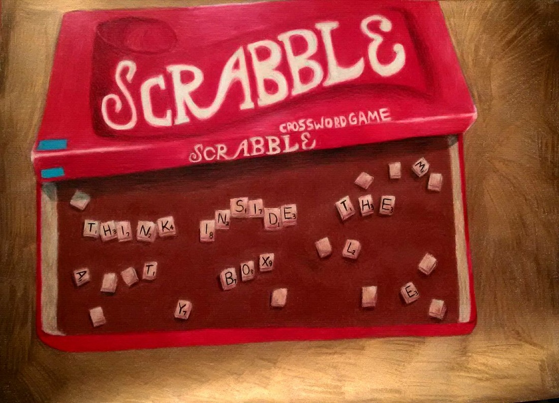
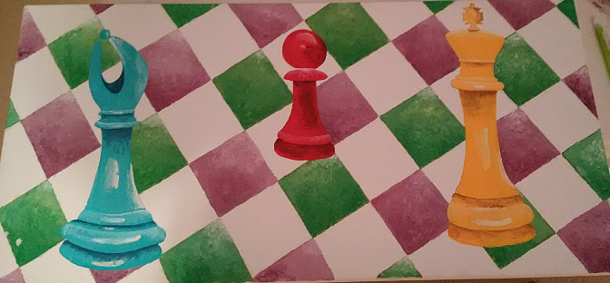
For this project I am not exactly sure what the set medium for the majority of the people was supposed to be because i know everyone was all over the place with this using primas and painting but i chose to do prismas again. The main idea for this project was that we were supposed to think of cool interior spaces and draw/paint it and/or what was inside of it and it took me a while to really come up with an idea that i would really enjoy doing and like. I started thinking about boxes and board game boxes because, obviously, that would be an interior space, and i tend to really like drawing board game paraphernalia for some reason, like the chess pieces. I remember Mrs. Rossi telling us to think OUTSIDE the box so i started thinking about the scrabble letters and how it would be cool to write some kind of message with the letters and then i thought it would be just perfect if the letters said think INSIDE the box since the letters would be placed inside the box after all. Photographing this was a bit of a challenge, i was trying to get it at a really cool angle that would give the box a cool perspective and try to make it like you really were looking right inside the box. After i sketched it out a few times, i decided that i was going to go with the toned paper from my toned sketch book because i really liked how even the colors could get on it and i think it help for the overall appearance of the seen. I think prismas might be one of my favorite mediums and i had a lot of fun with this. My favorite part was doing the tiles and trying to make them look really shaded but also look like tiles at the same time. Trying to get the actual Scrabble wording on the box was a challenge because it was hard to mock the actual font from the real box, and it was kind of an awkward creamish yellow. One thing i would like to go back and do is add a shadow to the bottom of the box reflecting o the background of the project because i think that aspect of the project looks really flat.
For this project we had to think of everyday objects in our lives and paint them on canvas using oil paints. This project would by my first project using oil paints besides the practice that we got to do with the oil apples right before this. I was looking around my house for everyday objects and was not really coming up with much inspiration for it until I saw the Halloween candy that my mom had just bought spread out on the the table to put in a bowl, candy that she had bought a whole month in advance which is weird i agree. I just decided to take a picture of it which i thought would be a cool perspective and it really fills up the whole canvas which would look really cool, and i think turned out pretty cool as well. I used a burnt sienna wash on my canvas and then started painting once it dried. The one thing i really enjoyed about doing this project if nothing else, was all the different variety of colors that i got to use, so i never really got tired of using the same one over and over which happens so often. The part that i really had a lot of trouble with was figuring out that you have to let the oils dry a little if you are trying to add in the extra values like shadows and highlights or it all kind of mixes together. Also, which i think must be obvious from my previous spelling errors in my Yankee candle project, i spelled starbursts wrong which really bothers me and i think that it sticks out like a sore thumb but maybe that's just because i know its there. Overall though i think i enjoyed using the oils and it was something cool and different to get to do and i would be down to use them again.
To prepare for the work with our everyday objects that we were to paint for our next project using oil paints we practiced on sheets of square canvas and did one with the paint brushes and one with a palette knife. We did an acrylic wash in the background and for the one with paintbrushes I used a blue wash and for the palette knife apple I did a burnt Sienna wash. The apple with the paintbrush turned out ok I think but I didn't do as much reflective values in the apple as I could have I think which might have helped with its 3 dimensional aspects. using the oil paint was a challenge and this was my first time working with it. Trying to figure out how to lay the paint down with it all blending together was hard especially when every time I would lay down white it would blend right in. The palette knife apple was just a ... no its just no. I never imagined how hard working with a palette knife would be but it was extremely difficult, like smearing on icing. I can't really see myself ever voluntarily working with the palette knife haha.
The Representational Reflective Drawing is our first in class structured project that we had to complete. For this project we had to think of things that would create a cool reflection in them, and then we would draw it out and color them with prisma colors. I had a hard time coming up with idea for things that I would want to do for this project but the top two that I had originally came up with was I set up all of my prisma color colored pencils and had them reflected in a circle in the lid of the prisma color tin. My other idea was having my cover for one of my records reflected in the record that goes in the cover. I actually ended up doing this three candles that I saw sitting on the table in my house one night though, because I noticed when you looked at it a certain way you could see the flame of the candle reflected in the back of the glass which I thought looked really cool and decided to do that instead. This was the first real project I have done with prisma colors in school and I actually think that I really enjoyed using them this time; I like the transformation your project goes through as you layer more and more color and it looks more and more realistic as you do that. I think this project turned out a lot better than I had expected but I would like to maybe try to go in and add more "wood-like" features to the table and go in and darken the shadows behind the candles so they stand out a little more but overall I think I am happy with it.
For my mixed media summer project I decided I wanted to paint this colorful chess set that my sister had out one day and was messing with and I thought it would be really interesting to paint. I decided to paint it on a canvas using pen, watercolor and acrylic. I used watercolor and acrylic on the background of the painting that is supposed to be representative of the chess board. For the three chess pieces I used acrylic and the pens for the shading. For the most part I like how this turned out except the pens used on the yellow chess piece gave the shadows a shiny look which I am not really a fan of so I will probably want to go back and fix that when I get a chance. Also, the reason that the chess pieces are different colors is because I actually ran out of the blue paint so the third chess piece actually ended up having to be yellow which I think turned out pretty good and is actually my favorite one that I painted.
Over the summer we made dream catchers with this volunteer y group and they turned out really really cool so I thought that it would be a really cool and interesting thing to draw a dream catcher. I originally wanted to do this in pen but I had a really really dark valued pencil with this pencil kit that I bought so i decided to use that and I really like how it made the values look and the contrasts from light to dark. This especially helped with the feathers because they would fade from dark to like and alternate patterns and things. I really like how this project turned out I think but if there's one thing I would like to add I would like to maybe get some kind of pop of color in there somewhere because I really don't like just the black and white so I don't know maybe if I could make a colorful background or colorful feathers or something.
For the drawing of three glass bottles that I had found around my house, I decided to use prisma color colored-pencils because I have always really liked the way they look and also I have never used prismas before so this would be a cool new thing to try. I found that prismas are really hard and challenge to get the hang of, the trick with layering is really hard to figure out. I think the project turned out pretty ok for my first try with prismas especially since so far I am not really a big fan of them. I do think as the bottles progressed that each bottle was better than the last though because I was figuring things out. I would like to go back in and add a background or shadows when I get the chance; I don't like how the bottles are just floating in the middle of the page.
For the Summer Work local hangout drawing all this summer it felt like I was at the pool every single day between swim practice and life guarding so I took a picture of the pool one day at work and thought it would be a pretty cool thing to do for the local hangout project especially with the angle from which the picture was taken and everything. I decided that I wanted to do this in watercolor because i thought I would be able to show the water really well with that medium and I had really liked working with the water color and pen from the previous project so i decided to do it again. I liked this project alot but one thing I would like to do better would be add in more shadows and detailed values with the pen.
For the summer work unusual interior I thought it would be a really good idea to do a refrigerator because of all the cool different kinds of shaped items and bottles that can be found in there as well as the variety of colors which would be fun. For my fridge I painted it with water color and went over top of it with black pen so the detail would be really visible and you could see each individual item in the refrigerator. This was my first time ever doing anything with watercolors and I actually think that I really liked them and they were fun to work with but it was also really difficult trying to get that happy medium with how much water and paint to use at a time. I actually got on a water color kick after this and my next project was also done with the water colors as well.
For the summer work portrait I decided to paint a picture of my cat Simba vs doing a self portrait. I did kind of a green wash in the background using all of the different shades of green that I had or that I could make. I think the cat was ok and that I did the fur pretty well but I would like to go back in now and try to give it a little more shape or volume so that it looks less flat. I would also like to do more with the cats ears because I feel like if I really get them right then it could really emphasize the cats 3 dimensional figure. and really make it pop more off of the canvas vs how flat it looks now.
|
AuthorWrite something about yourself. No need to be fancy, just an overview. Archives
March 2016
Categories |